Thinking about how to get people to actually do something on your website? You've probably heard about landing pages, and for good reason. They're super important for turning visitors into customers or leads. We're going to look at some awesome examples that really nail it, and hopefully, you'll get some ideas for your own beat funnel strategy. It's all about making that first impression count and guiding people smoothly towards what you want them to do.
Key Takeaways
- A clear headline grabs attention and tells visitors exactly what to expect.
- Keep the design clean and focused, with a strong visual hierarchy guiding the eye.
- Use compelling copy that highlights benefits and speaks directly to your audience.
- Social proof, like testimonials, builds trust and credibility quickly.
- A prominent, clear call-to-action (CTA) tells people what to do next.
1. Beats by Dre
Alright, let's talk about Beats by Dre. You know, the headphones that practically scream 'cool' before you even put them on? Their landing page totally gets it. It's all about showing off those slick designs and the tech that makes your music sound like it's happening live.
They don't mess around with a bunch of confusing stuff. Instead, you get big, eye-catching pictures and short, punchy text that tells you exactly why you need these cans. We're talking sound quality that'll blow your socks off and battery life that just keeps going.
And that 'Add to Bag' button? It's right there, big and bold, practically begging you to click it. It’s like they know you’re already sold and just want to get your hands on them ASAP.
What's super smart is how they keep that 'buy now' button visible as you scroll. No more hunting around for it when you finally decide you need those headphones. It's always within reach, making it ridiculously easy to complete your purchase.
Here's the lowdown on what makes their page work:
- Showcase the Style: Big, beautiful images that make you want to touch them.
- Highlight the Tech: Quick, clear points about what makes the sound amazing.
- Easy Peasy Buying: A prominent button that makes checkout a breeze.
- Keep it Visible: A floating header means the buy button is always there for you.
Seriously, it’s a masterclass in making you want something and then making it super simple to get it. They nail the balance between looking awesome and being incredibly functional.
2. Calm
Feeling like your brain is a browser with way too many tabs open? Yeah, me too. That's where Calm swoops in, like a fluffy cloud of zen for your stressed-out noggin. Their landing page totally gets it. It’s not just a bunch of fancy words; it’s like a digital deep breath.
Right when you land, you're hit with this super chill vibe. Think soft colors, maybe a gentle animation, and a headline that’s like, "Hey, wanna feel less frazzled?" They make it incredibly easy to see what they're about: better sleep, less stress, and just generally feeling more chill. It’s like they’re saying, "We got you, fam."
What's cool is how they show you what you're getting without making you sign up for a secret society. You can peek at some guided meditations, and there are these little lock icons that make you think, "Ooh, what's behind door number one?" Plus, they sometimes have a little banner about a discount – not in your face, but just enough to make you think, "Hmm, maybe now's the time."
Basically, their page feels like the app itself: simple, soothing, and actually helpful. It’s a great example of how a landing page can feel like the start of a good thing, not just another chore.
Here's what makes their page work:
- Clean Design: No clutter, just peaceful visuals that match their brand.
- Clear Value: You know exactly what problems they solve.
- Gentle Nudges: They encourage you to explore without being pushy.
- Sense of Calm: The whole experience feels like a mini-meditation itself.
3. Nuun

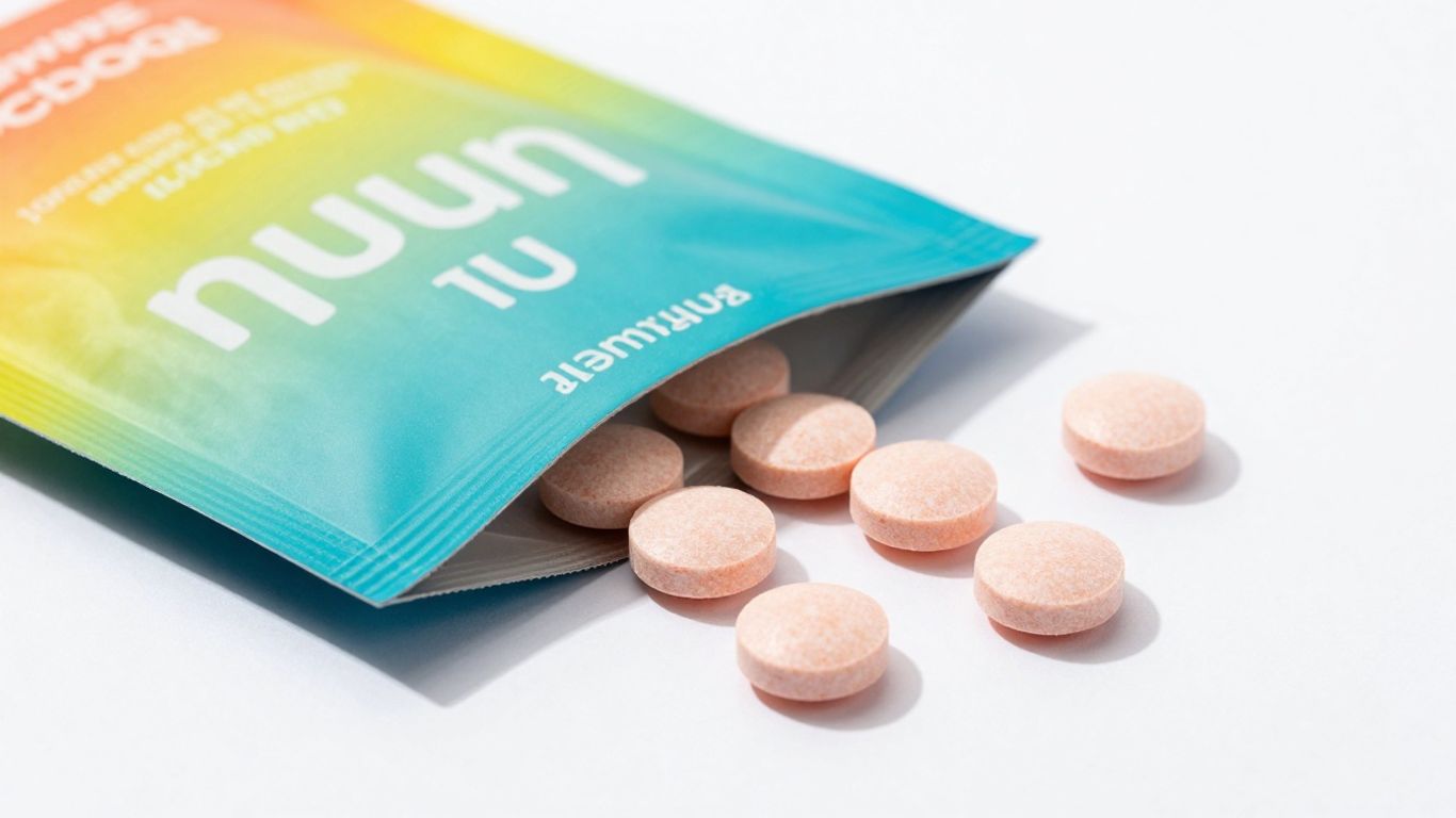
Alright, let's talk about Nuun. If you're someone who likes to stay hydrated, especially when you're on the move or hitting the gym, you've probably heard of them. Their landing page for their loyalty program is a total blast of color and fun. Seriously, it's like a party for your eyeballs!
They've packed it with emojis, a header that actually moves (how cool is that?), and images of tropical fruits. It's all about getting you hyped for their loyalty program, where more Nuun means more points, which then means more rewards. It’s a super clear message that’s hard to miss.
What's great is how they keep the energy up with their copy. Phrases like "Fun stuff starts right now!" really match the vibe. Even though there are a few buttons that look like they do different things, they all point you to the same spot. It’s a smart way to guide you without making you think too hard. If you're curious about how they keep their customers engaged, checking out their loyalty program page is a good start.
They really nail the idea that getting rewarded for your purchases should be exciting, not a chore. It’s all about making you feel good about sticking with the brand.
4. Helix
Alright, let's talk about Helix. You know, the folks who want you to get your best sleep ever? Their landing pages are pretty slick, especially when they're pushing a deal. They really know how to make you feel like you're about to snag the bargain of a lifetime.
What's cool is how they slap those dollar amounts right in your face. Like, "Save $100!" or "Get $50 Off!" It's not subtle, but hey, it works, right? They make it super obvious what you're getting, which is awesome when you're just trying to figure out if it's worth your hard-earned cash. It’s all about showing you the savings.
Here’s a peek at how they often structure things:
- Big Savings Highlight: Usually the first thing you see, screaming about how much money you'll keep in your pocket.
- Product Benefits (Briefly): They'll mention why their mattress is amazing, but they don't go on forever. Think comfort, support, cool sleep – the good stuff.
- Clear Call to Action: A bright, unmissable button that practically begs you to click it and claim your deal.
- Easy Sign-up: Sometimes, they'll have a little form at the bottom. And guess what? It only asks for one thing – usually your email. Super simple, makes you feel like you're not giving away the farm just to get a discount code.
They understand that when you're looking for a mattress, you're probably also looking for a good deal. So, they put that front and center. It’s a smart move that cuts through the noise and gets straight to what matters to a lot of shoppers.
If you're thinking about how to make your own product pages pop, especially when you've got offers running, Helix is a great example to check out. They’re not just selling a mattress; they’re selling a smart purchase. You can even see how other companies transform ideas into products with a similar focus on clear value propositions.
5. 6KU
Alright, let's talk about 6KU and their landing page for the Urban Track bike. If you're looking for a page that practically screams 'get on this bike and ride!', this is it. They've really gone all out to show you what this bike is all about, and honestly, it makes you want to ditch whatever you're doing and hit the streets.
First off, they've got this action-packed video. It's not just some boring product shot; it's a whole vibe. You see someone cruising through the city, looking cool, and you can totally picture yourself doing the same. It’s like a mini-movie for your eyeballs, selling the dream of urban cycling.
Then there's the photo game. They mix it up with cool lifestyle shots – you know, people actually using the bike and looking good doing it – and then zoom in on the details. You get to see the bike from every angle, so you know exactly what you're getting. It’s a smart way to build excitement and show off the goods.
This page doesn't just show you a bike; it sells you an experience. It’s all about the feeling of freedom and style that comes with riding their Urban Track.
What makes it work so well?
- Visual Storytelling: The video and photos work together to tell a story, not just list features.
- Dynamic Presentation: A mix of motion and still images keeps you engaged.
- Clear Next Step: When you're ready to buy, there's a clear link to the actual product page.
It’s a great example of how to make a product page feel alive and make you want to click that 'shop' button.
6. Wix

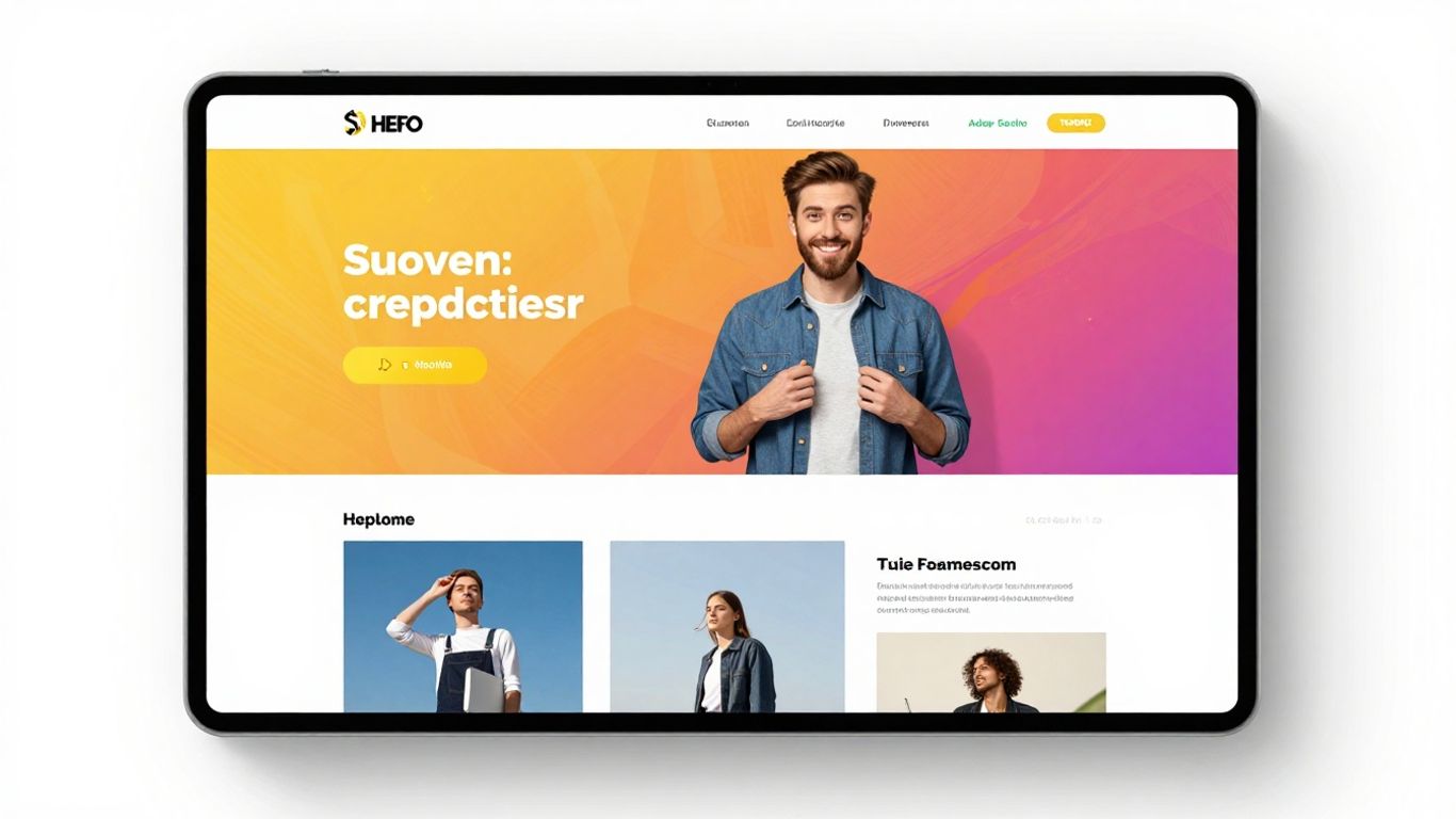
Alright, let's talk about Wix. You know, that website builder that makes you feel like a design wizard even if your artistic skills are, well, let's just say developing? Their landing pages are pretty slick, and honestly, they've got a good thing going. They’re all about making it super easy for you to get your own awesome landing page up and running, no matter what you're selling or promoting.
What's cool is how they show off what's possible. They’ve got these pages that are super clear about what they do, with big, friendly buttons that practically scream, "Click me!" It’s like they know you’re busy and don’t want to hunt for the next step. Plus, they sprinkle in these little bits of proof, like how many sites go live every day. It’s a nice little nudge, right?
Here’s the lowdown on what makes a Wix landing page work:
- Grab attention right away: They nail the headline game. It’s short, sweet, and tells you exactly what you’re getting.
- Visuals that pop: Forget boring stock photos. Wix uses images that feel fun and make you think, "Yeah, I can do that!"
- Call to action that’s impossible to miss: Seriously, their buttons are everywhere. You can’t scroll too far without seeing a clear next step.
- Show off the wins: They highlight success stories and user projects, making you feel like you’re joining a winning team.
They really focus on making the whole process feel achievable. It’s not just about building a website; it’s about making your idea a reality without needing a degree in computer science. They’ve figured out how to balance looking professional with being super approachable.
And get this, they even let you test out different button colors. Yeah, you heard me. They’re that into making sure every little detail is just right to get you to take that action. It’s a smart move, and it shows they’re serious about helping you succeed. So, if you're looking to build your own landing page, Wix is definitely worth a look.
7. ExpressVPN
Alright, let's talk about ExpressVPN. You know, that service that makes your internet connection feel like it's wearing an invisibility cloak? Their landing page totally gets it. It’s all about making you feel safe and making things super simple, which, let's be honest, is exactly what you want when you're dealing with your online privacy.
They hit you with a headline that promises a smooth online ride, and the visuals? They show someone zipping through all sorts of digital stuff. It’s like, 'Yeah, you can do all that, and we’ll keep it safe.' As you scroll, they break down the main perks of using a VPN. Think of it like this:
- Global Access: Want to watch that show only available in another country? They make it sound easy.
- Security: They explain how they keep your data locked down tighter than a drum.
- Speed: No one likes a slow connection, and they promise you won't even notice they're there.
What’s really smart is how they build trust. Since it’s a security tool, they can’t just say 'trust us.' Instead, they use a clean, no-fuss design and simple language. Plus, you’ll see those little badges from places like Trustpilot and app stores – big signs that these folks are legit. It’s all about making you feel good about handing over your digital keys. They even make it easy to get help, with a clear link to 24/7 support. Because if something’s not working, you want it fixed now, right? Check out how they build trust on their landing page for more ideas.
8. Blue Apron
Okay, let's talk about Blue Apron. You know, the meal kit service that basically says, 'Hey, you wanna eat something decent tonight without, like, actually trying?' Their landing page totally gets it. It's all about showing you mouth-watering pictures of food that make you think, 'Yeah, I could probably make that... maybe.'
They're not just selling you ingredients; they're selling you a solution to that age-old question: 'What's for dinner?' Seriously, who has the brainpower to figure that out after a long day? Blue Apron steps in with its drool-worthy photos and copy that's easy to digest (pun intended). It feels like they actually understand your dinner-time struggles.
Here's what makes their page a winner:
- Visual Feast: Those photos aren't just pretty; they're practically a culinary siren song. You can almost smell the garlic and hear the sizzle. It makes cooking seem less like a chore and more like a fun little project.
- Problem Solver: They highlight how they tackle common dinner dilemmas – no time, no inspiration, or just plain exhaustion. It's like they're saying, 'We got this, you just focus on not burning the chicken.'
- Clear Calls to Action: You'll see buttons like 'Shop Now' or 'Browse the Full Menu,' plus tempting offers. They're basically nudging you towards that delicious, stress-free meal.
Blue Apron's landing page is a masterclass in making a service feel both aspirational and totally achievable. They know you're busy, and they've designed their page to make your decision as easy as, well, following a recipe.
9. LinkedIn Ads
Alright, let's talk about LinkedIn Ads. You know, the platform where you can actually reach people who might, you know, buy your stuff? It’s not just for scrolling through your cousin’s vacation photos anymore. LinkedIn has figured out how to make their ad platform landing page work for businesses, and honestly, it’s pretty smart.
They get that you’re probably not here to admire the digital wallpaper. You want to know if this is the right place to spend your marketing budget. So, they lay it all out pretty clearly. You’ll see how you can target specific industries, job titles, or even skills. It’s like having a superpower for finding exactly who you need.
Here’s a peek at what makes their page tick:
- Clear Value Proposition: They don't mess around. You get to see the benefits of advertising on LinkedIn right away. Think reaching decision-makers and getting your message in front of the right eyes.
- Interactive Elements: Ever get bored scrolling? LinkedIn uses things like carousels to show off their features. It’s a neat way to keep you engaged without feeling like you’re reading a textbook.
- Actionable CTAs: Buttons like "Create an Ad" are strategically placed. They’re not shy about telling you what to do next, which is exactly what you want on a landing page.
They understand that businesses want results, not just fancy graphics. So, they focus on the 'why' and the 'how' of their ad platform, making it easy for you to see the potential return on your investment. It feels professional, direct, and honestly, pretty effective.
10. Hootsuite
Alright, let's talk about Hootsuite. If you're drowning in a sea of social media posts and feeling like you're juggling flaming chainsaws, this is your lifeboat. Their landing page gets straight to the point: save a ton of time managing your social media. Seriously, who has time to post to every single platform individually anymore? Hootsuite bundles it all up, making it feel less like a chore and more like, well, actual management.
They highlight some pretty sweet features, like scheduling posts way in advance (so you can actually have a life!) and using AI to figure out the best time to post. Because let's be honest, we're all guessing most of the time. Plus, they make it super easy to jump in with a 30-day free trial. No excuses!
What's cool is how they show you it's not just some random tool. They flash logos of big-name companies that use it, which is a smart move. It's like saying, "Hey, if Coca-Cola trusts us, you probably can too!"
Here's the lowdown on why their page works:
- Clear Value: Right at the top, they tell you how much time you'll save. That's the good stuff.
- Easy Action: A big, bright button for that free trial is impossible to miss.
- Trust Builders: Those company logos? They're like a digital handshake, making you feel more secure.
- Simple Process: They even break down how easy it is to get started, usually in just a few steps.
They make it feel like social media management shouldn't be a headache. It's all about simplifying your life and making your content work smarter, not harder. Pretty neat, huh?
Looking for awesome rap beats? We've got over 120 tracks ready for you, starting at just $7.99. Get instant downloads and clear rights so you can use them right away. Check out our amazing deals, like buy two get one free, to save even more on your next project. Visit our website today to find the perfect beat!
So, What's the Takeaway?
Alright, so you've seen some seriously cool landing pages. They're not just pretty pictures; they're like super-focused salespeople, ready to grab attention and get people to do that one thing you want them to do. Remember, it's not about having the fanciest design (though that helps!), it's about being clear, making it easy, and giving folks a good reason to click. Don't be afraid to borrow ideas, test things out, and just get started. You've got this!
Frequently Asked Questions
What exactly is a landing page?
Think of a landing page as a special page on a website made for one main thing. It's usually where you send people after they click on an ad or a link. The goal is to get them to do something specific, like sign up for something or buy a product, without too many distractions.
Why are landing pages so important for businesses?
Landing pages are super helpful because they focus on getting visitors to take a single action. This makes it easier to track what's working and helps turn visitors into customers or leads more effectively than a regular website page might.
What makes a landing page good?
A great landing page has a clear headline that grabs attention, tells you what it's about right away, and has a simple button telling you exactly what to do next. It also looks nice and is easy to use, especially on your phone.
Should I put a lot of text on my landing page?
Not usually! Good landing pages keep the text short and to the point. They highlight the benefits for you, the visitor, and avoid overwhelming you with too much information. You want to make it easy for people to understand and act.
How do I know if my landing page is working well?
You can check how many people visit the page and how many actually do the thing you want them to do (like clicking a button or signing up). This is called the conversion rate. If it's low, you might need to tweak the page.
Can I use the same landing page for different ads?
It's best to create a unique landing page for each ad or campaign. This way, the message on the ad matches what people see on the landing page, making them more likely to take action. It's like telling a specific story to a specific group.


